
 A little fast-running image slideshow that plays on hover and pauses when mousing out. The current image will stay visible.
Today I want to share a little hover slideshow with you. The main idea is to run a super-fast image slideshow on hover and show the current image when mousing out. It’s just a fancy effect to play with and I got the idea from Contain.r. We’ll be using CSS animations for the slideshow and control the pausing and running with animation-play-state.
Please note: this is just experimental and will only work as intended in browsers that support the respective CSS properties.
This is our simple structure:
1
2
3
4
5
6
7
8
9
10
11
12
13
14
15
16
|
<div class="hs-wrapper">
<img src="images/1.jpg" alt="image01"/>
<img src="images/2.jpg" alt="image02"/>
<img src="images/3.jpg" alt="image03"/>
<img src="images/4.jpg" alt="image04"/>
<img src="images/5.jpg" alt="image05"/>
<img src="images/6.jpg" alt="image06"/>
<img src="images/7.jpg" alt="image07"/>
<img src="images/8.jpg" alt="image08"/>
<div class="hs-overlay">
<span>Summer <strong>2012</strong></span>
</div>
</div>
We’ll show and hide the images using an animation:
1
2
3
4
5
6
7
|
.hs-wrapper img{
top: 0px;
left: 0px;
position: absolute;
animation: showMe 0.8s linear infinite 0s forwards;
animation-play-state: paused;
}
|
The animation will be paused and we’ll just run it on hover:
1
2
3
|
.hs-wrapper:hover img{
animation-play-state: running;
}
|
The animation will simply make an image visible and put it on top of the “stack”:
1
2
3
4
5
6
|
@keyframes showMe {
0% { visibility: visible; z-index: 100; }
12.5% { visibility: visible; z-index: 100; }
25% { visibility: hidden; z-index: 0; }
100% { visibility: hidden; z-index: 0; }
}
|
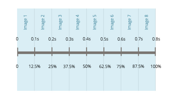
As you can see, each image will have the same animation but we will start the animation for each image with a delay. We also want to reverse the stacking order of the images by setting the z-index accordingly. Since we will run the whole animation for 0.8 seconds, we’ll delay the start for each image with 0.1 second (except the first one):
1
2
3
4
5
6
7
8
9
10
11
12
13
14
15
16
|
.hs-wrapper img:nth-child(1){
z-index: 9;
}
.hs-wrapper img:nth-child(2){
animation-delay: 0.1s;
z-index: 8;
}
.hs-wrapper img:nth-child(3){
animation-delay: 0.2s;
z-index: 7;
}
.hs-wrapper img:nth-child(4){
animation-delay: 0.3s;
z-index: 6;
}
<!-- ... and so on -->
|
The percentages of the animation are calculated as follows: take the 100% of the animation timespan and distribute 8 images over it. Each one runs 0.1 seconds which means that at 12.5% we want the second image to show. The second image that will show, will be on top of the current one (although they have the same z-index) because it follows in the HTML structure. Having tried some other possibilities (i.e. not messing around with the z-index, setting 12.6% as the next step, etc.) it seems that this variant performs the smoothest. Nonetheless, sometimes there seems to be a bit of a lag.
The overlay, which will be shown on hover, will have an absolute position and since we want to fade it in and animate the box shadow, we’ll add a transition to it:
1
2
3
4
5
6
7
8
9
10
11
|
.hs-overlay{
position: absolute;
width: 100%;
height: 100%;
opacity: 0;
z-index: 500;
background: rgba(0,0,0,0.6);
box-shadow: 0 0 0 0 rgba(255,255,255,0.3) inset;
pointer-events: none;
transition: all 0.3s linear;
}
|
On hover, when the slideshow starts running, we’ll show the overlay:
1
2
3
4
|
.hs-wrapper:hover .hs-overlay{
opacity: 1;
box-shadow: 0 0 0 5px rgba(255,255,255,0.3) inset;
}
|
You can increase the opacity level of the background color of the overlay in order to make the effect more subtle. Note, that the images have the same background which makes this effect less seizure-inducing than if you would use a different color for each one. Black and white images with a not too transparent overlay like in Contain.r are a good fit for this effect.
And that’s it! I hope you find it inspiring.
|


 Follow @mickyroudy


